A. FILM
B. PRINT
C. OUTDOOR
D. RADIO
E. FILM CRAFT
F. DESIGN
G. DIGITAL & MOBILE
H. CREATIVE USE OF MEDIA
I. PR
J. MARKETING SERVICES
K. ADVERTISING CAMPAIGNS
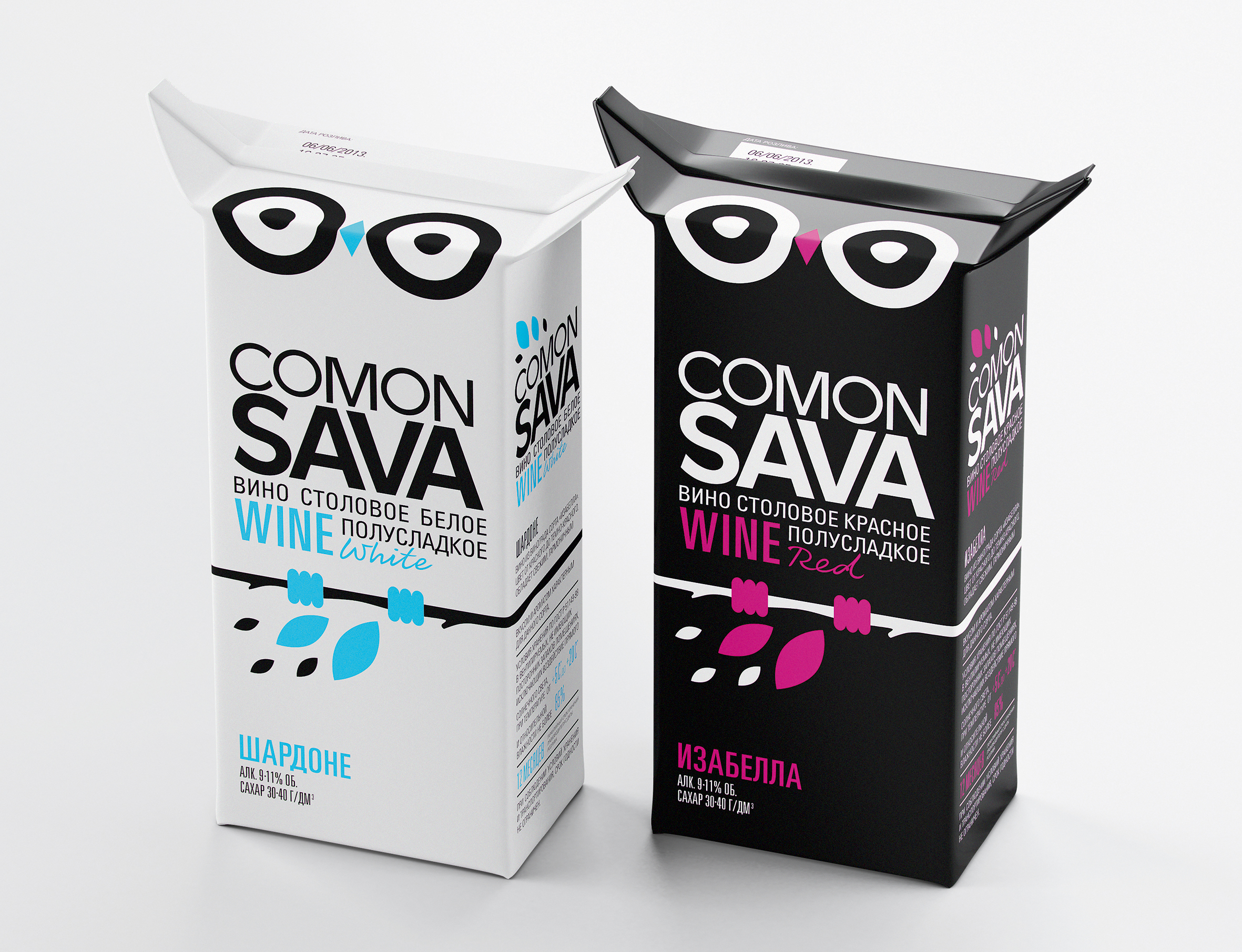
F-08-01. COMON SAVA
| Agency | COMON SAVA |
| Creative head | Arthur Schreiber |
| Author of idea | Pavla Chuykina , Roman Inkeles, Arthur Schreiber |
| Product | COMON SAVA |
| Description | It comes from French greeting «Comment ?a va» which sounds very similar to Russian word «sova» (owl) and altogether with «comon» it sounds like «come on sova!», (it literally means «come on owl!»). These phonetic synonyms are perfect match because the main hero of this package is owl by itself. Normally Tetra-Pak wines are standing on lower store shelves and consumers have to look down to see it. And it is getting quite difficult to imagine these wonderful Italian landscapes and juicy grapes in your mind which are pictured on packages when you are looking at it from up to down! But it would be impossible not to notice the pair of eyes on the top of package looking right at the consumer and that`s the trick! When you look at the package design closer you can also see the pair of cartoon ears. To make this personage alive just don`t turn down two cartoon corners on both sides of top of the package and the ears will appear! |
| Advertiser | Vino-Grande |
| Team members | Director: Roman Inkeles Art Director: Arthur Schreiber Designer: Pavla Chuykina 3D: Maxim Kadashov Visualisation: Ivan Zherebin |