A. FILM
B. PRINT
C. OUTDOOR
D. RADIO
E. FILM CRAFT
F. DESIGN
G. DIGITAL & MOBILE
H. CREATIVE USE OF MEDIA
I. PR
J. MARKETING SERVICES
K. ADVERTISING CAMPAIGNS
F-01-65. Kaunas Sharing
| Agency | Not Perfect Y&R I Vilnius |
| Creative head | Marius Lukosius |
| Author of idea | Irmantas Savulionis |
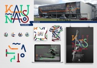
| Product | The logo of Kaunas city |
| Description | The logo of Kaunas city After a research effort, we discovered that Kaunas, for its citizens, means different things that merge into one structure. Singlular parts of the structure are not static: they have directions as stripes we leave in space and time. The face of the city is never completed. It’s constantly changing. Life is versatile and multi-coloured. Kaunas is a multifaceted and live city. KAUNAS SHARES. Kaunas shares: jazz and basketball, science and technologies, culture and tradition, entrepreneurship and innovations, joy and thoughts - impressions. The aspiration of sharing reveals the goodwill and open spirit of the city as well as the exciting and relevant content. The logo of Kaunas city consists of different coloured stripes. Stripes that bend, cross each other and interlace, engaging into structure, constituting the logo. This stripe interlacing design principle is an essential tool when emulating the visual identity. Stripes expand beyond the logo to any direction by tying it to any surrounding context maintaining two key principles: the stable bandwidth and logo inherent rhythmics. Different colours of the stripes are designed to define the different layers of city life: yellow – culture, blue – business, red – history, green – sport. |
| Advertiser | Kaunas City Municipality |
| Team members | Rapolas Vosylius - Designer, Irmantas Savulionis - Head of Art |


