A. FILM
B. PRINT
C. OUTDOOR
D. RADIO
E. FILM CRAFT
F. DESIGN
G. DIGITAL & MOBILE
H. CREATIVE USE OF MEDIA
I. PR
J. MARKETING SERVICES
K. ADVERTISING CAMPAIGNS
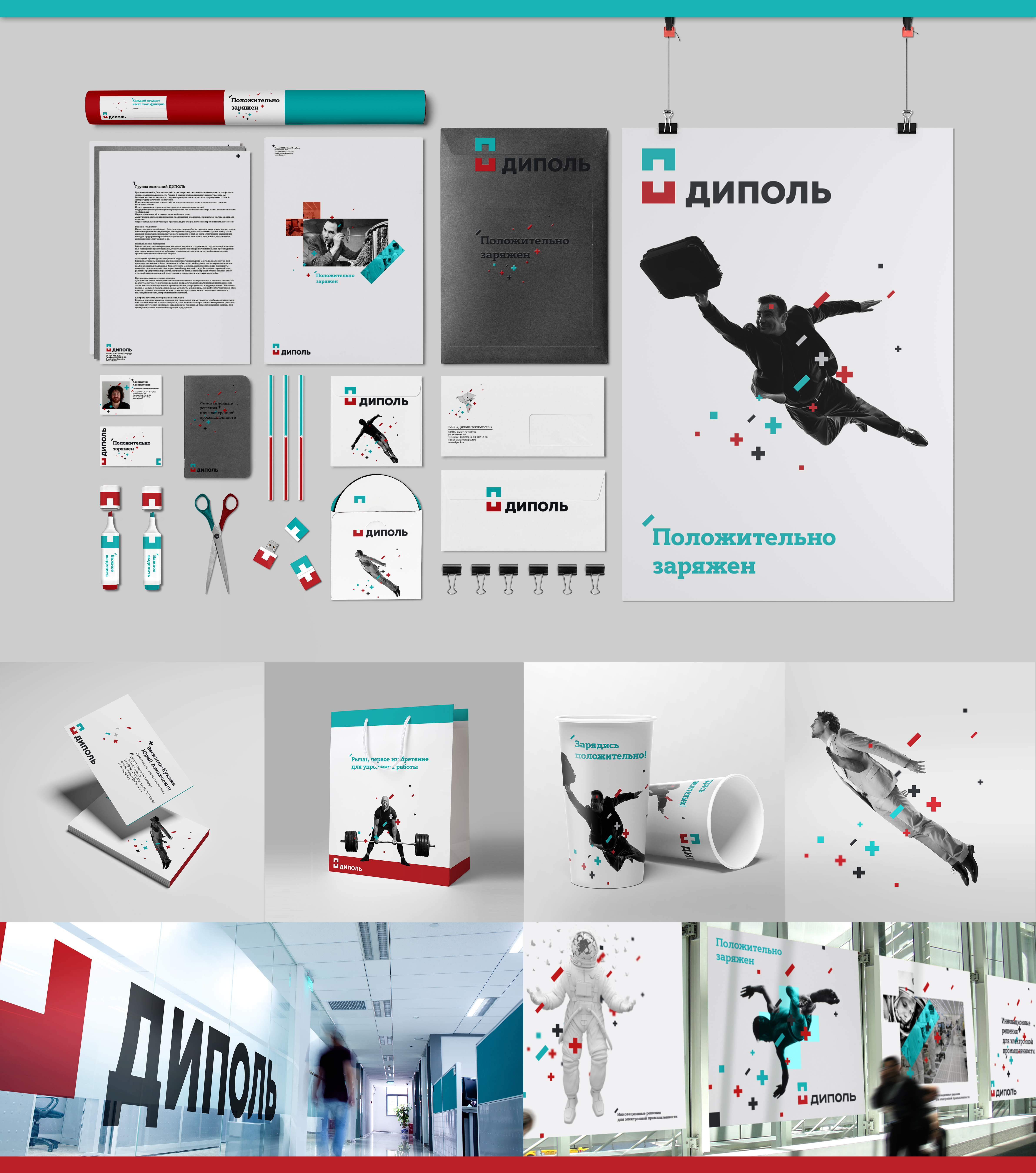
F-01-47. Dipaul
| Agency | Brandson |
| Creative head | Stanislav Antonov |
| Author of idea | Brandson |
| Product | Dipaul |
| Description | Dipaul is one of the leaders on market of electronic goods and components. Though the key values of this market are accuracy, strict and guardedness, we have found a way to display values of the company with wide and emotional language on visual level. The idea of the logo resembles 2 magnets that merges into single form of ta plus. Red signifies knowledge while blue - technology. The combination creates new quality level - a positive charge (which is explicated in brand line), a key emotional response during the contact with a brand. The logo reveals the companies positioning: austere geometry (projecting), combining 2 elements (synergy effect and complex attitude) and intend to increase knowledge (the space between the 2 elements). Magnetism (in particular - magnetic dipole) is one of the manifestations of levitation in nature. That is why the core of corporate identity are people levitating in space, ideas, as well as various real-world objects that take on new meaning thanks to innovation. The idea of this solution is that Dipaul is not just a supplier but creator of new technologies that helps to make our life easier, brighter and richer. |
| Advertiser | Dipaul |
| Team members | Strategy: Elena Yufereva, Gregory Khrabrov Project Director: Elena Arkadieva Project Manager: Yana Vysotskaya Art Director: Stanislav Antonov Design: Konstantin Ishmuhamedov Copywriting: Aleksey Kazantsev, Gregory Khrabrov |