A. FILM
B. PRINT
C. OUTDOOR
D. RADIO
E. FILM CRAFT
F. DESIGN
G. DIGITAL & MOBILE
H. CREATIVE USE OF MEDIA
I. PR
J. MARKETING SERVICES
K. ADVERTISING CAMPAIGNS
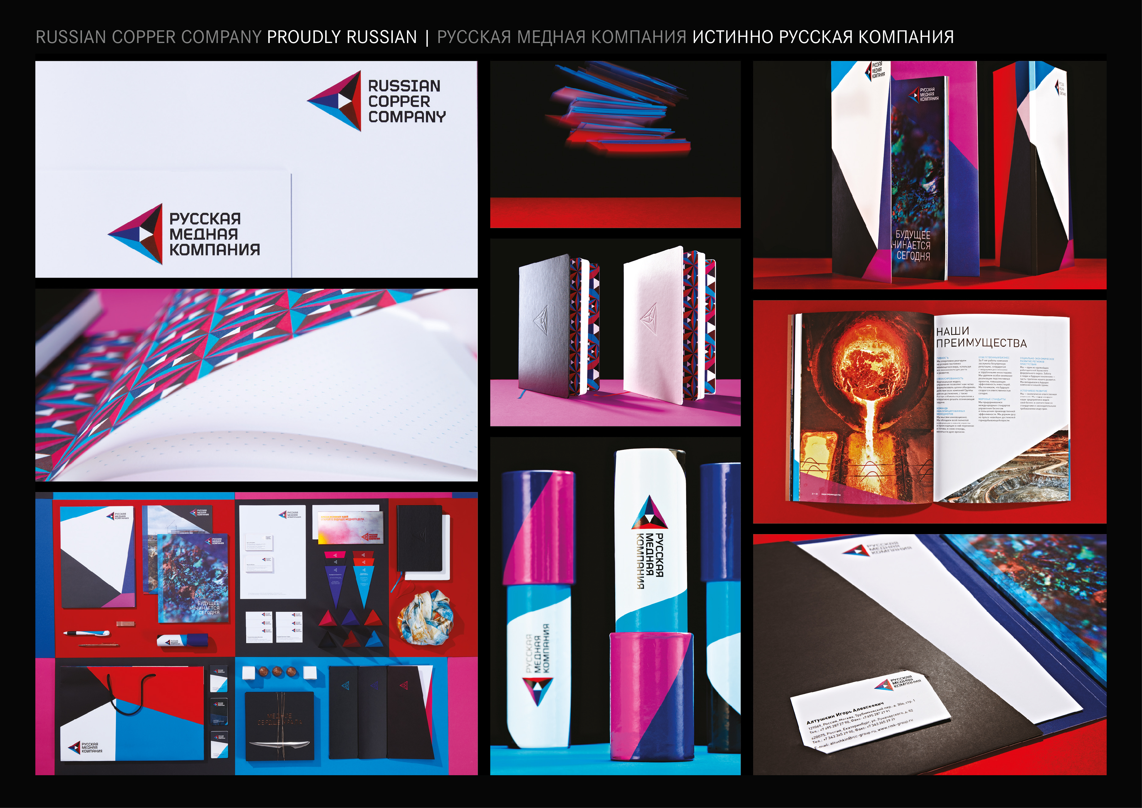
F-01-81. Proudly Russian
| Agency | Landor Associates |
| Creative head | Katie Taylor - Creative director |
| Author of idea | Landor Associates |
| Series | Russian Copper Company |
| Product | Russian Copper Company |
| Description | RCC needed a brand to embody their new strategic story – ‘The smartest and best run copper company in the world. Proudly Russian and an icon of modern Russia’. The symbolic mark represents pure focus and their dynamic drive to number one. The colour palette embodies Russianness and copper, it uses the red, white and blue of the national flag combined with hues of copper from its various forms. Russian inspired patterns, striking dynamic cuts and graphic angles feature throughout the identity with the central triangle becoming a frame of focus within applications. The complete identity system is bold and vibrant, creating an impression of modernity, dynamism and pride. |
| Advertiser | Russian Copper Company |
| Team members | Katie Taylor - Creative director Tony Lyons - Design director Juergen Bamberg - Senior designer David Marreiros - Designer |