A. FILM
B. PRINT
C. OUTDOOR
D. RADIO
E. FILM CRAFT
F. DESIGN
G. DIGITAL & MOBILE
H. CREATIVE USE OF MEDIA
I. PR
J. MARKETING SERVICES
K. ADVERTISING CAMPAIGNS
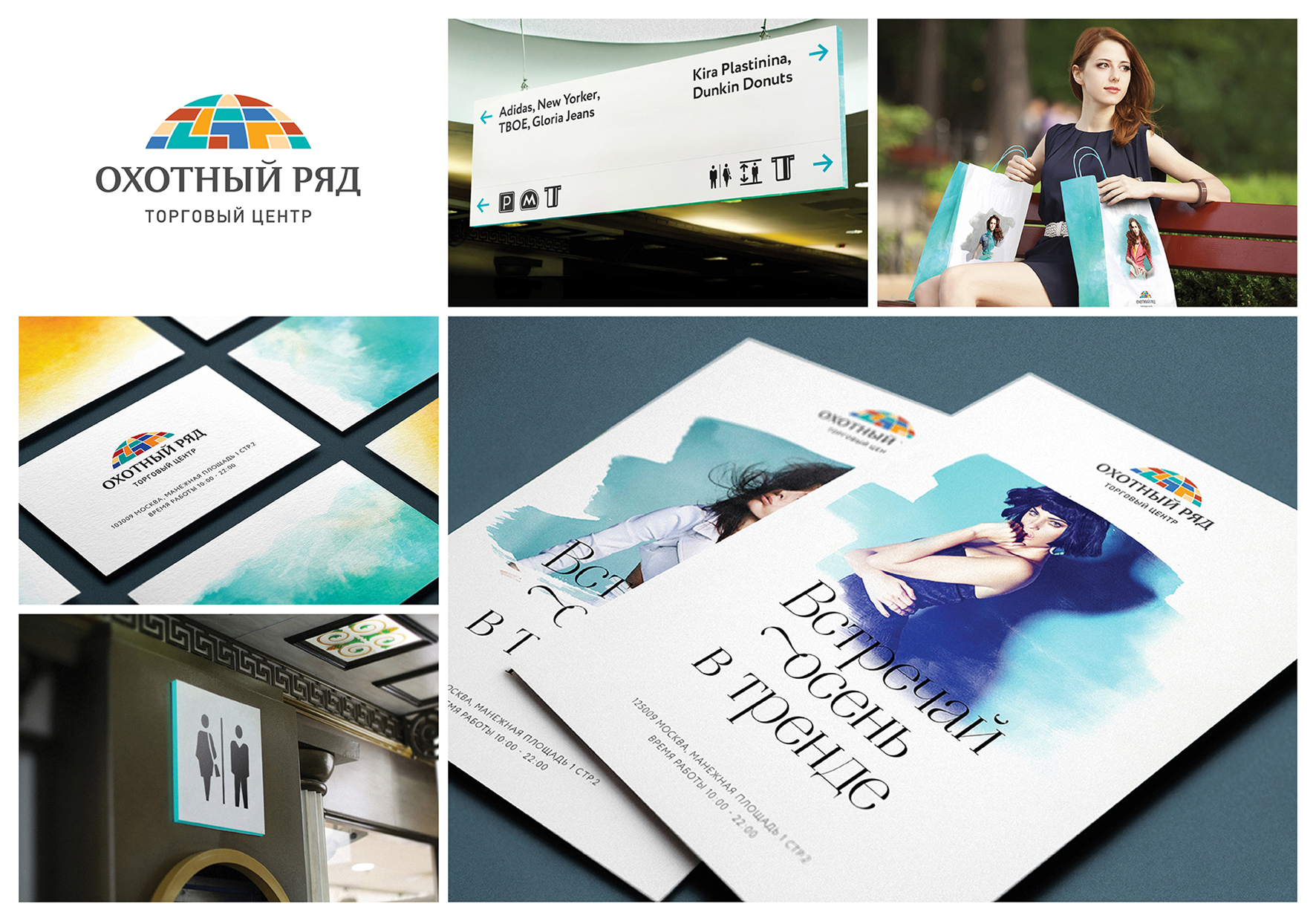
F-01-20. Okhotny Ryad
| Agency | LINII Design Lab |
| Creative head | Mikhail Gubergrits |
| Author of idea | Sergey Lavrinenko |
| Product | shopping mall |
| Description | Corporate identity for shopping center “Okhotny Ryad” was designed on the basis of new repositioning, which obtained a new name “Fashion novelties center”. Shopping center will be new and modern, according to the new strategy. Main target audience of the shopping center is young people from 20 to 30 years old, mainly females. As a result, modern and stylish corporate color spectrum was suggested, together with recognizable corporate color — turquoise, which will be the shopping center’s visiting card. In addition to the new color spectrum, “Okhotny Ryad” will have its own remarkable graphic component — conventionalized background water-paintings with different images above. New color spectrum together with water-paintings creates more stylish, pure, slight and transparent brand’s appearance with subtle and womanlike elements. Shopping center’s logotype has been changed as well: leaving the recognizable hemisphere, LINII design studio corrected graphics, worked with color spectrum, making it more unique and modern. Also, improved typography, giving it more originality. Typography is based on Aire Bold font, developed by Argentinian type studio Lian Types, supporting general brand’s visual concept – light and modern. |
| Advertiser | Okhotny Ryad LLC |
| Team members | Mikhail Gubergrits, Sergey Lavrinenko |