A. FILM
B. PRINT
C. OUTDOOR
D. RADIO
E. FILM CRAFT
F. DESIGN
G. DIGITAL & MOBILE
H. CREATIVE USE OF MEDIA
I. PR
J. MARKETING SERVICES
K. ADVERTISING CAMPAIGNS
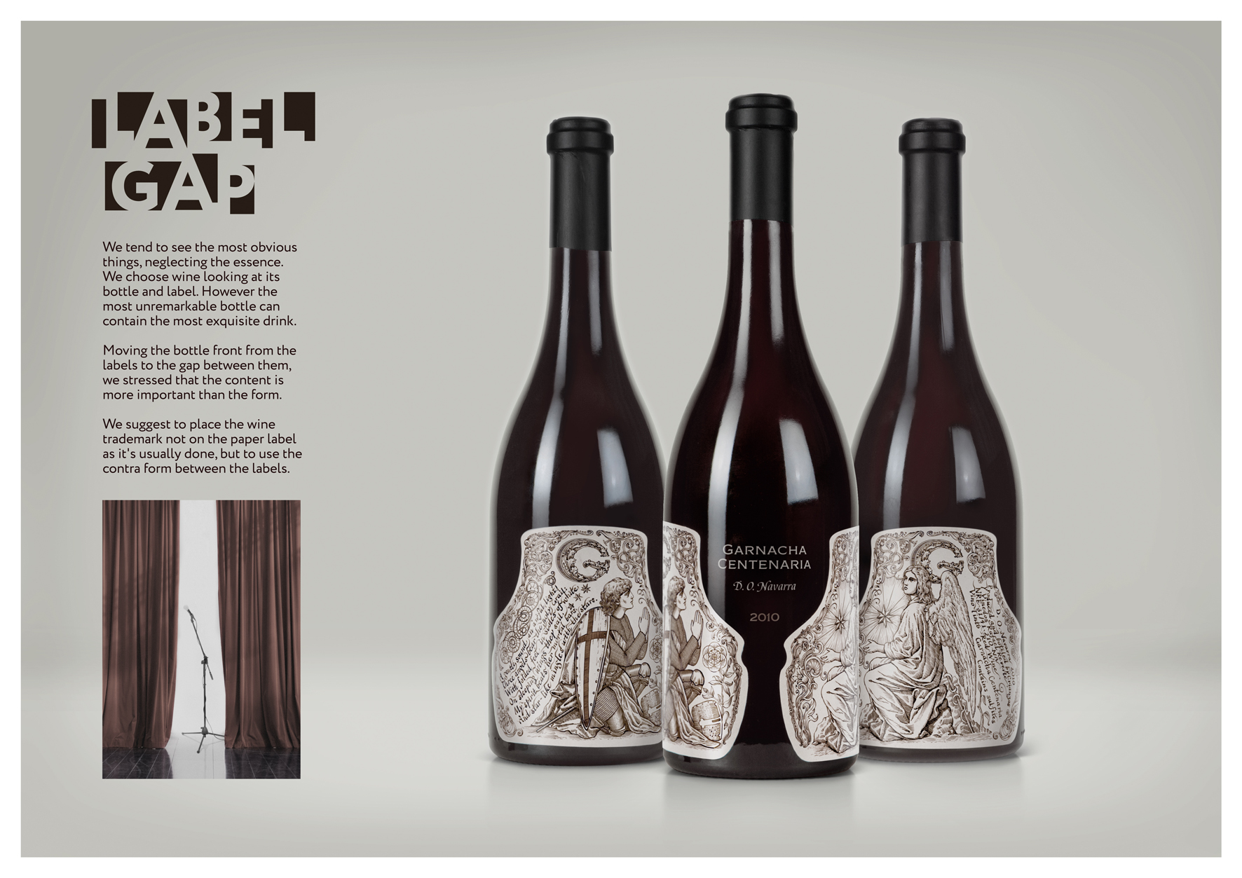
F-08-61. LABEL GAP
| Agency | Depot WPF |
| Creative head | Alexey Fadeev |
| Author of idea | Alexandr Zagorsky |
| Product | premium red wine |
| Description | We tend to see the most obvious things, neglecting the essence. We choose wine looking at its bottle and label. However the most unremarkable bottle can contain the most exquisite drink. We suggest to place the wine trademark not on the paper label as it's usually done, but to use the contra form between the labels. Moving the bottle front from the labels to the gap between them, we stressed that the content is more important than the form. However… Who said that the form in this case don't need to be perfect? |
| Advertiser | Crianzas y Vi?edos R. Reverte |
| Team members | Alexey Fadeev, creative director Alexandr Zagorsky, art director Vadim Briksin, illustrator Julia Zhdanova, calligrapher Alexandr Kishchenko, designer Ekaterina Lavrova, copywriter |