A. FILM
B. PRINT
C. OUTDOOR
D. RADIO
E. FILM CRAFT
F. DESIGN
G. DIGITAL & MOBILE
H. CREATIVE USE OF MEDIA
I. PR
J. MARKETING SERVICES
K. ADVERTISING CAMPAIGNS
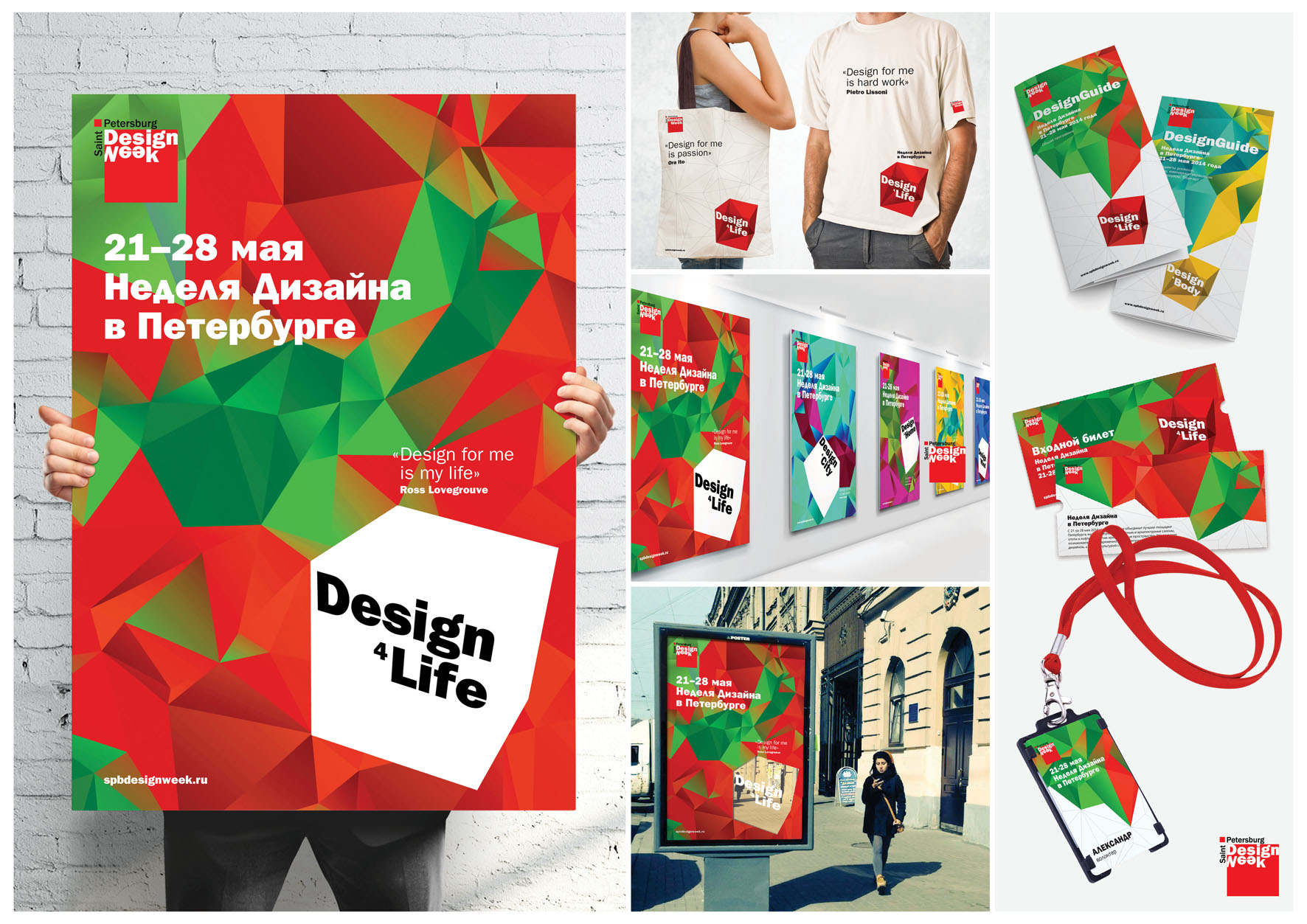
F-01-07. Фирменный стиль фестиваля Design Week 2014
| Агенство | Студия графического дизайна DEZA |
| Творчий керівник | Александр Суворов |
| Автор ідеї | Ирина Шмидт |
| Продукт | Фестиваль Design Week 2014 |
| Опис | Task. To create a corporate identity conception for one of the biggest Russian design events - St. Petersburg Design Week. The main task was to save recognition and to use corporate colors – red, white and black. Solution. During it’s existence, Design Week turned into trend event attracting tens of thousands of visitors and uniting hundreds of designers from all over the world. For already four years Petersburg Design Week helps to change people’s world view and continues changing itself. Last three years numeral analogies were used in it’s corporate identity: a “two” in 2012, a “three” in 2013 and a “four” in 2014. Using this sequence we decided to make accent on it with help of the system of the Platonic solids. Thereby the symbol of Festival 2013 – the triangle – became a base for tetrahedron, which, in turn, affected on appearance of the symbol of 2014 – the cube. The volume symbol allowed us to fantasize with objects and space, remaining the same their structure, filling them with color, focusing on white, free field of creation, or excluding their filling to see live life of the city. All this form and space metamorphosis reflect the point of designer’s world view, which the event of international scope - St. Petersburg Design Week - introduces year after year. |
| Рекламодавець | FineStreet Media Group |
| Склад творчої групи | Арт-директор: Ирина Шмидт Дизайн: Ирина Шмидт |